Adaptive Web Designing
“Adapting web pages for the capabilities of the device or browser used to view them”
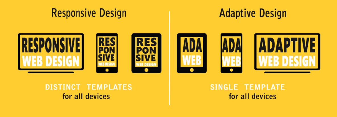
The term Adaptive Web Design (AWD) was coined by Aaron Gustafson to describe a way of optimising web pages for the device or browser used to view them. Beginning with principles of progressive enhancement, AWD seeks to create an appropriate experience for users no matter what device or platform they use.
AWD uses techniques such as responsive web design (RWD) and feature detection to deliver an optimised version of the site. Though visuals will change, ideally functionality will be similar, and content should be consistent everywhere.
Optimisations may include increasing the size of controls to make them touch-friendly, integrating functionality like telephone calls or camera use when compatible hardware is detected, or sending smaller images to devices on slower internet connections.
Responsive Web Design
“Techniques and technologies for optimising user experience on a wide range of devices”
The growth of smartphone and tablet devices in recent years has seen the range of screen sizes and resolutions skyrocket. As it would be impractical to build many websites to suit every possible environment, responsive design has emerged as a method for creating single, flexible websites which can deliver an optimal experience throughout this huge range of devices.
Through use of CSS media queries, many device properties can be detected. By identifying the width, resolution, and display ratio of the screen (amongst other things) the layout and style of the page can be adjusted to suit.
It is important to note that responsive web design (RWD) only affects the layout and visual style of the page. Commonly confused with RWD is Adaptive design, a catch-all term which includes other techniques and technologies used to enhance the user experience to best suit the device.


